A jacket can be the color you wanted and still pull across the back. Trousers can fit beautifully and remain difficult to combine with anything in the cupboard. Body shape and colour analysis can help describe these separate problems, but combining them too early makes shopping harder. I would first establish what the garment needs to do, then compare its color within a complete outfit. You can make progress without solving every style label.
Name the problem before choosing a system
If the waistband gaps while the hips fit, begin with cut, rise and sizing. If the outfit feels visually disjointed despite comfortable fit, examine color repetition, contrast and proportion. If a shade near your face seems distracting, compare it under consistent light. Each observation points to a different test. Calling all three a body type problem leaves you with advice that is too broad to use.
Measurement-based body shapes describe selected proportions. Seasonal color systems group colors through an interpretive approach to appearance. One does not determine the other. A person with a relatively defined waist can enjoy many palettes; someone with similar shoulder and hip measurements can do the same. Shape charts cannot identify an undertone, and palette charts cannot choose your trouser rise.
Keep a simple note for the garment in question: “sleeve tight when reaching,” “color difficult beside existing coat,” or “hem catches on shoe.” Precise language gives you a task you can complete in a fitting room. It also prevents a disappointing purchase from becoming a verdict about your body.
Settle the movement test before judging the color
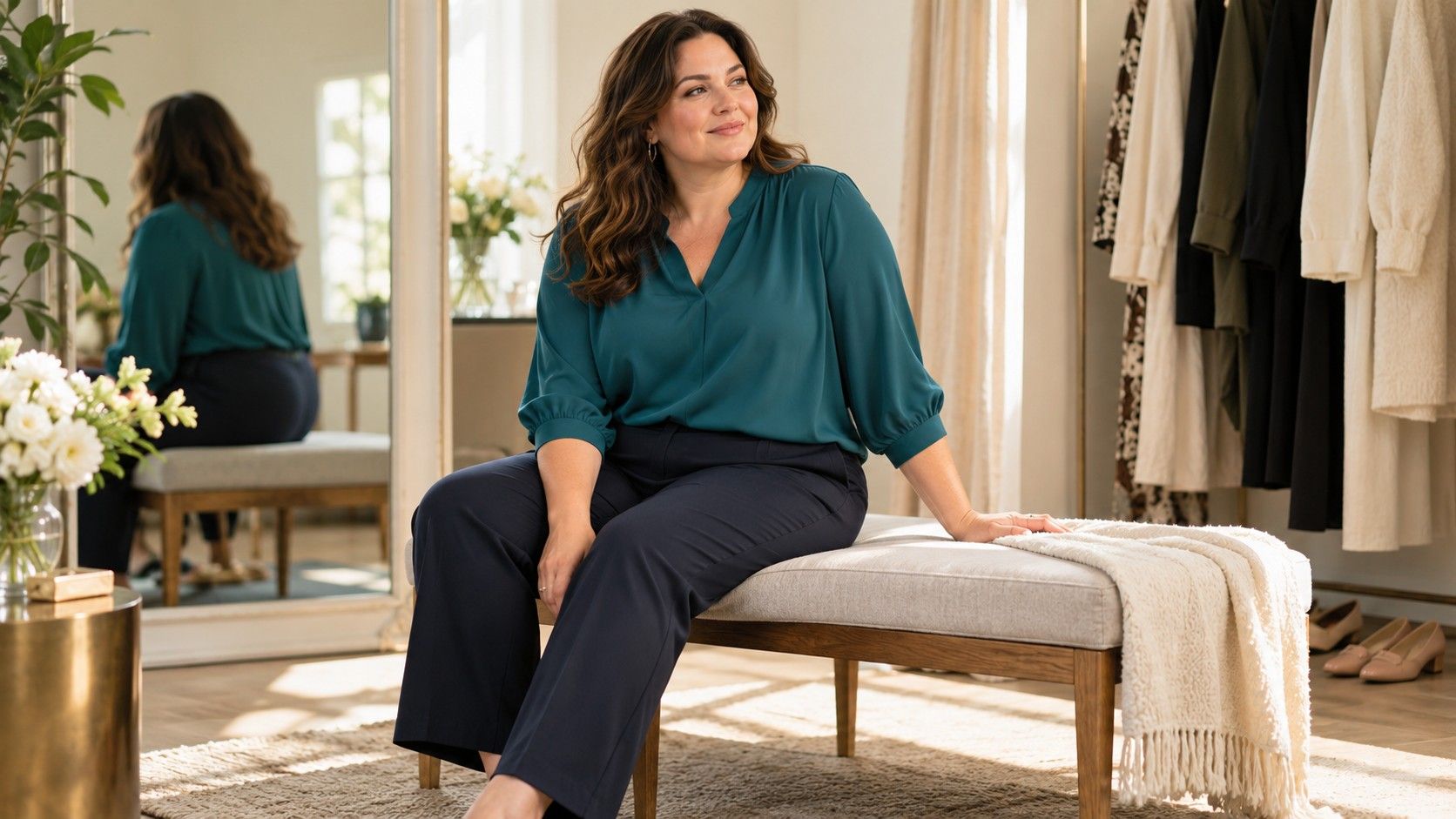
Try the garment in the size that permits the intended movement. Sit in trousers, reach forward in a jacket and lift your arms in a top. Check whether seams pull, pockets flare or the hem shifts more than you want. These observations concern the garment on your body, regardless of any shape label you use.
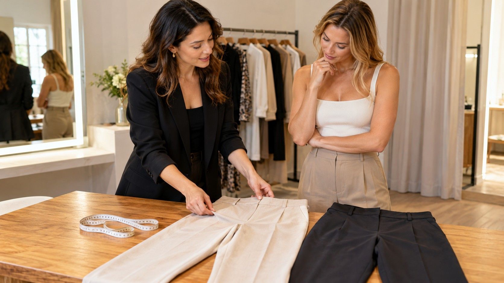
Construction can change between apparently similar pieces. A stretch trouser and a rigid woven trouser may fit differently even with the same stated measurements. Lining can restrict a jacket that feels roomy from the outside. Compare the actual items rather than assuming your familiar size will behave consistently across a brand.
Once you have a comfortable version, look at its silhouette with your intended shoes and outer layer. A trouser hem that looks right barefoot may bunch on a boot; a blouse that works untucked may gather awkwardly under a short jacket. Fix those relationships before deciding whether a different color would rescue the outfit. Sometimes the repair is simply another hem length.
Compare color where you will actually wear it
For a top or scarf, hold the color near your face in indirect daylight, then look under ordinary indoor lighting. Compare two options at a time while keeping the background and other clothes similar. Observe your preference without demanding an immediate seasonal diagnosis. Color analysis is a styling framework, and screen-based charts cannot provide an objective verdict.
For trousers, skirts and shoes, compatibility with the rest of the wardrobe may matter more than a face-level comparison. Lay them beside the tops and coat you expect to wear. A lovely green trouser becomes less useful if every available top creates a combination you dislike. Consider the full outfit before committing to the isolated shade.
Phone cameras change exposure and white balance, while store lights can shift how colors look. Take photographs as reminders rather than calibrated color measurements. If possible, inspect an online purchase at home during the return window with your actual clothes. A retailer's name for a shade is less reliable than the fabric in front of you.
Use color placement as a preference rather than a correction
You can repeat a color at the top and shoes, keep the outfit in neighboring shades or place a strong contrast at the waist. These choices change the visual rhythm. None is automatically required by a pear, apple, rectangle or hourglass label. Decide whether you want a continuous effect, a visible break or an accent that draws attention to a favorite item.
Dark colors do not remove fit problems. A dark shirt still shows pulling at the buttons, and dark trousers can still cling or twist. Likewise, a light-colored jacket can look deliberate and comfortable when its cut works for you. Avoid buying an uncomfortable version because a chart claims the color will make a body area disappear.
Print adds another variable. The scale and spacing of a pattern may matter as much to your impression as the background shade. Compare a small repeated print with a larger, more open pattern if both are available. Check them from normal conversational distance, rather than judging only the close-up view in a mirror.
Build one outfit in a sequence you can repeat
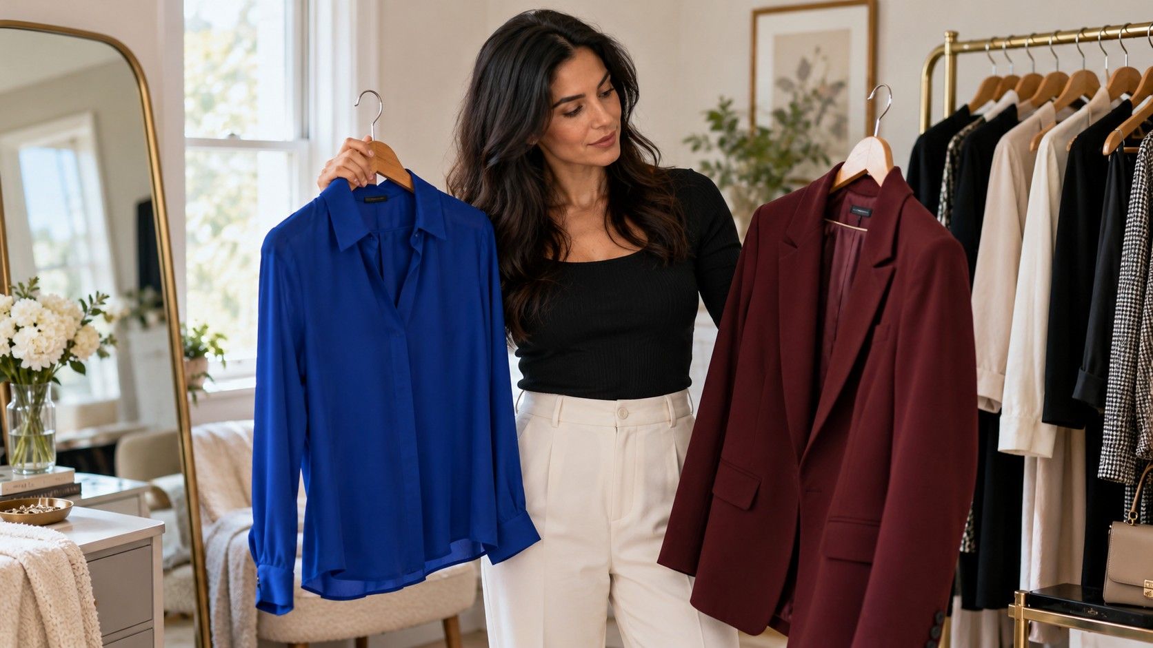
Suppose you need an outfit for a working day with a walk and a seated meeting. Start with comfortable trousers and shoes that manage the route. Add a top that allows movement, then try your jacket over it. Only after those pieces work together should you compare a blue and a cream version of the top. You have reduced the number of changing variables.
If the cream creates more contrast than you enjoy, test a mid-toned alternative before replacing the trousers. If the blue works but feels dull, repeat it in a scarf or add a detail you already own. A small adjustment can resolve the visual problem. The entire outfit does not need to follow one named seasonal palette to feel coherent.
For an occasion outfit, begin with the item that has the hardest practical requirement: shoes for standing, a dress that allows sitting, or an outer layer suited to the weather. Then build color around it. This order respects the event you will attend, instead of allowing a palette graphic to dictate a purchase that fails on the day.
Shop for combinations instead of isolated flattering pieces
Before buying a garment, identify at least two complete outfits using clothes at home. Include shoes, underlayers and outerwear. If the item needs a new bra, a different jacket and matching shoes, count those requirements in the real cost. A color and body type analysis is useful only if it leads to choices you can afford and wear.
Write down garment measurements when a piece works especially well, such as the rise and inseam of trousers or the length of a jacket. Keep color observations beside those measurements, but do not merge them into a body label. “This rise works seated” and “this navy pairs with my coat” are separate successes worth repeating.
Let your notes remain provisional. Fabric, lighting, comfort and personal taste can all change the outcome. A useful wardrobe grows from repeated, specific observations. You can borrow body shape language for proportion and color language for combinations while continuing to judge each garment on its own merits.