A search for Soft Natural outfit ideas can leave you with a wardrobe full of beige linen, even when you wanted a black evening top. That is a problem with the examples, rather than evidence that your coloring and preferred silhouette disagree. Kibbe image identities and seasonal color palettes address different styling questions. I would separate the garment from its color first, then bring them back together in outfits that work for your actual week.
When the mood board keeps showing the wrong colors
Soft Natural is a term within David Kibbe's image identity framework. Deep Winter and Soft Autumn belong to seasonal color analysis, where naming and palette boundaries vary between practitioners. Neither color label follows automatically from an image identity. A person exploring Soft Natural can consider saturated cool colors, muted warm colors or another palette without needing a different body to make the combination legitimate.
The internet often packages these ideas as a single aesthetic. Loose cream knits, tan sandals and tousled hair become shorthand for one identity, while polished black clothes get assigned elsewhere. Those are editorial choices. A black knit can have the same construction as a camel knit. Begin by checking what you actually liked in the picture: an open neckline, a softly shaped waist, the fabric movement or simply the peaceful background.
Keep a small distinction in your notes. Write silhouette observations on one line and color preferences on another. For example, “this blouse has enough room across my upper back” is a useful garment observation. “This dark blue works with my existing coat” is a useful color observation. Neither statement proves a Kibbe identity or a season, and both can guide a sensible purchase today.
Compare the same garment before changing the whole outfit
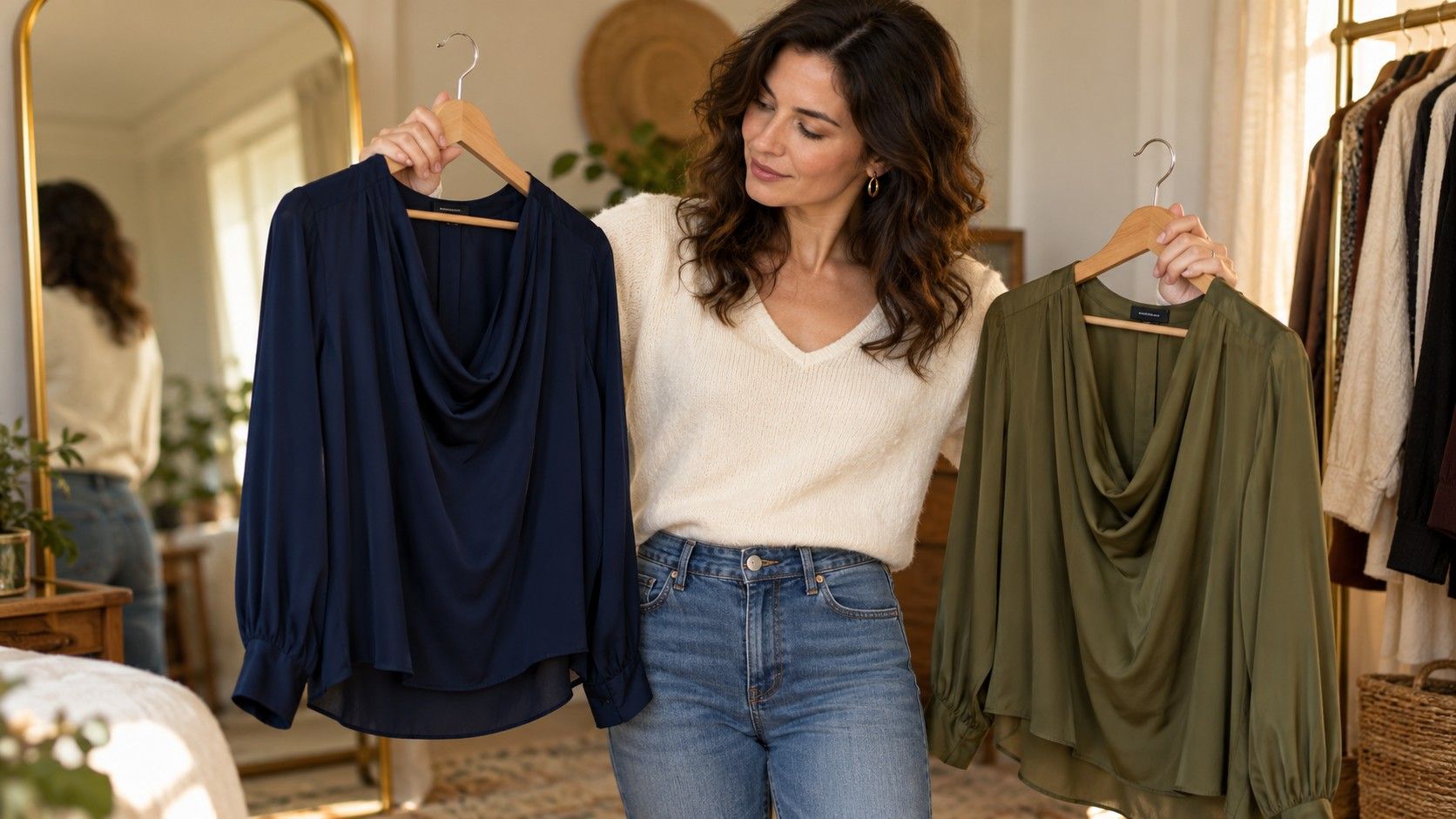
If a retailer offers one top in navy and olive, compare those two versions before judging unrelated dresses. Check that the fiber content and lining are actually the same; a pale color may be lined while a dark version is not. Hold both near your face in indirect daylight and then try each on. The first comparison concerns color; the second reveals neckline, fit and how the fabric settles.
A phone photo can help record combinations, but automatic exposure and white balance alter the result. A black top may make the camera brighten your face; a pale top may prompt the opposite adjustment. Use the same position, light and camera settings where possible. Treat the images as wardrobe records, rather than proof that you belong to a particular color season.
Also look at the garment away from the mirror. Raise your arms, sit down and reach forward. Does the sleeve pull the neckline back? Does a tucked hem work its way out? A flattering shade cannot repair a top that needs constant adjustment. I would settle these practical issues before deciding that a palette has failed, especially when trying an unfamiliar cut.
Make a Deep Winter combination without adding stiffness
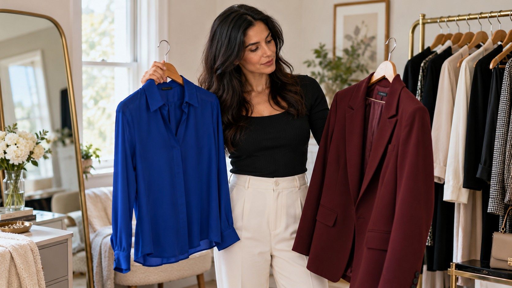
For a Soft Natural Deep Winter experiment, start with colors you already use: perhaps a dark navy knit, charcoal trousers and a berry scarf. These are examples to test, not a prescribed palette. Choose a knit with comfortable movement across the shoulders and enough recovery that it keeps its shape. A dark color does not require rigid tailoring, shiny hardware or a sharply buttoned collar.
Lay the outfit beside the shoes and outer layer before leaving the room. A long dark coat can change the apparent continuity of a navy top and charcoal trousers; bright white trainers can create a deliberate break. Decide whether you like that interruption. The question is about the whole outfit, and you can answer it without declaring that contrast is universally right or wrong for your identity.
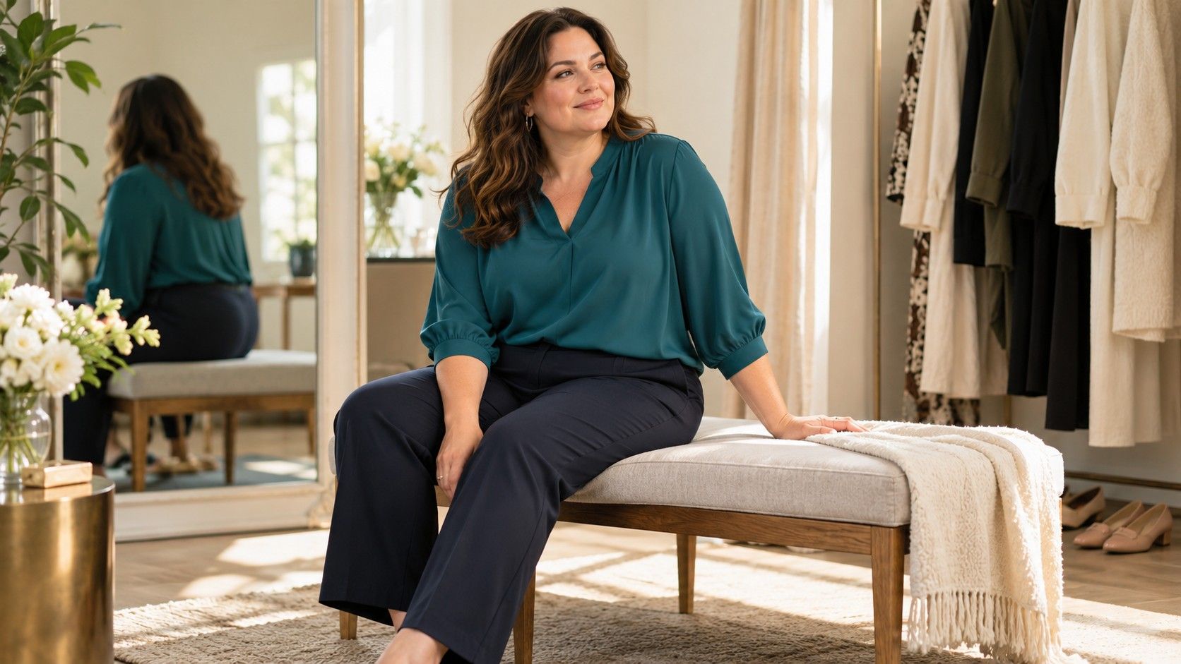
For dinner, the same experiment might use a fluid dark blouse, comfortable straight trousers and an earring with a restrained shine. Inspect transparency and bra compatibility under indoor lighting. The outfit needs to survive sitting at a table and wearing a coat. A photograph of an unbuttoned blouse on a model cannot answer those questions for you.
Keep a Soft Autumn outfit from becoming a beige uniform
A Soft Natural Soft Autumn search often returns warm neutrals from head to toe. If you enjoy that, it can be a convenient starting point. If the result feels flat, compare nearby colors such as a muted green top with a warm brown trouser or a dusty terracotta scarf with a soft cream knit. Palette names should support variety within your preferences rather than remove it.
Texture matters because color is seen on a surface. Brushed wool, matte cotton and satin reflect light differently even when their product descriptions use the same shade name. Put the pieces together in daylight, then check them under the lamps where you normally dress. A muted green satin blouse may feel more vivid than a green cotton shirt, so judge the object rather than the swatch alone.
A low-contrast outfit can still have clear structure. Check the shoulder placement, trouser rise and hem break. If everything is large and soft, the effect may be more volume than you wanted; that does not mean you need to abandon muted colors. Try adjusting a sleeve or changing one garment's length before buying a sharper-colored replacement.
Use two outfit recipes as tests, not identity rules
Try a workday recipe first: comfortable trousers, a knit that drapes without clinging, shoes you can walk in and an outer layer that fits over the sleeves. For a darker palette, test navy with charcoal and a cool-looking accent you enjoy. For a softer warmer palette, test brown with muted green and a warm neutral. These are trial combinations with equivalent jobs, rather than opposing dress codes.
For a relaxed weekend, keep your jeans and change only the top and scarf. This is a better comparison than replacing trousers, shoes, jewelry and hair at once. Spend a normal morning in the result. Notice whether the scarf slips, the neckline needs arranging or the top catches on the waistband. Useful style evidence often arrives while carrying shopping or getting on a bus.
If one recipe works, repeat it with pieces you own before shopping. You might discover that your favorite outfit uses colors from several online palette charts. That is acceptable. Seasonal systems are subjective styling tools, and the practical aim here is a coherent wardrobe, not passing a test based on someone else's screen.
Buy the missing garment rather than a new set of labels
Before ordering anything, name the gap precisely: a washable dark top with room in the sleeve, a muted scarf that works with two coats, or trousers that sit comfortably when seated. Bring that description into the fitting room. It is harder to get distracted by a generic “Soft Natural essential” when you know the actual function the piece must perform.
Check the return conditions before experimenting with an unfamiliar color. Compare the new piece with your existing trousers, coat and shoes while the tags remain attached. An isolated success in the shop may become awkward at home if every combination requires another purchase. A garment that completes three outfits usually teaches more than an aspirational piece that completes none.
Keep the result in ordinary language: “navy knit works under the grey coat,” or “this olive is too yellow beside my scarf.” Your notes can change as your taste and circumstances change. You can explore Kibbe ideas and seasonal colors at the same time without demanding that one system certify the other.